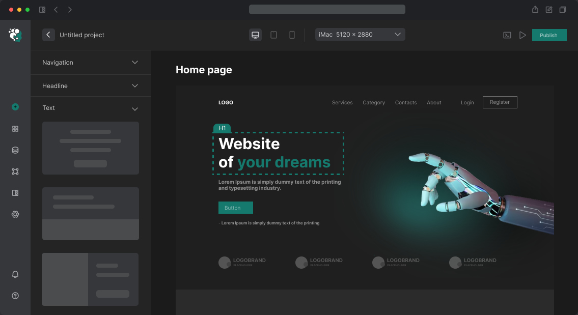
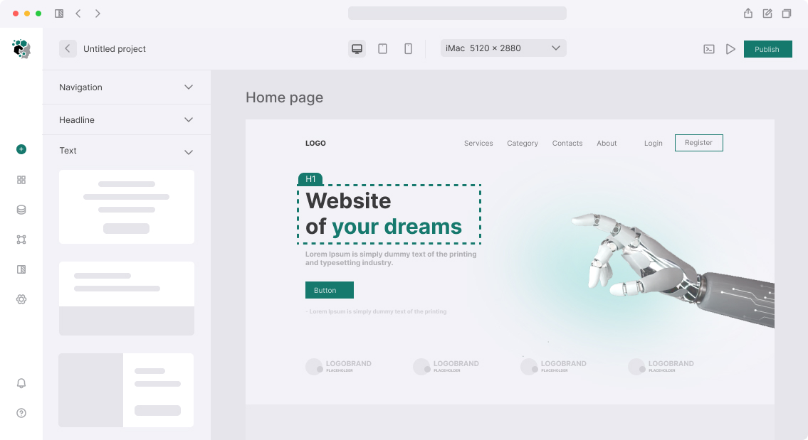

Вёрстка сайта с использованием Styled Components
Styled Components — CSS-in-JS библиотека, которая создаёт React-компоненты с инкапсулированными стилями. Каждый компонент получает уникальный хешированный класс, стили скопированы и изолированы. Поддерживает темизацию через ThemeProvider, dynamic styles через props, и SSR через серверный рендеринг стилей в <head>.
Установка
npm install styled-components
npm install -D @types/styled-components babel-plugin-styled-components
// babel.config.js или .babelrc
{
  "plugins": [
    ["babel-plugin-styled-components", {
      "displayName": true,      // Имя компонента в DevTools
      "fileName": true,
      "meaninglessFileNames": ["index", "styles"],
      "pure": true,             // Tree-shaking
      "ssr": false
    }]
  ]
}
Для Vite:
// vite.config.ts
import { defineConfig } from 'vite';
import react from '@vitejs/plugin-react';

export default defineConfig({
  plugins: [
    react({
      babel: {
        plugins: ['babel-plugin-styled-components'],
      },
    }),
  ],
});
Система темы
// src/theme/theme.ts
import { DefaultTheme } from 'styled-components';

export const lightTheme: DefaultTheme = {
  colors: {
    primary: '#2563eb',
    primaryHover: '#1d4ed8',
    primaryLight: '#eff6ff',

    background: '#f9fafb',
    surface: '#ffffff',

    textPrimary: '#111827',
    textSecondary: '#6b7280',
    textMuted: '#9ca3af',

    border: '#e5e7eb',
    danger: '#dc2626',
    success: '#16a34a',
  },
  typography: {
    fontFamily: '"Inter", system-ui, sans-serif',
    fontMono: '"JetBrains Mono", monospace',
    fontSizeSm: '0.875rem',
    fontSizeBase: '1rem',
    fontSizeLg: '1.125rem',
    fontSizeXl: '1.25rem',
    fontSize2xl: '1.5rem',
    fontSize3xl: '1.875rem',
    fontSize4xl: '2.25rem',
  },
  spacing: {
    xs: '0.25rem',
    sm: '0.5rem',
    md: '1rem',
    lg: '1.5rem',
    xl: '2rem',
    '2xl': '3rem',
    '3xl': '4rem',
  },
  borderRadius: {
    sm: '4px',
    md: '8px',
    lg: '12px',
    xl: '16px',
    full: '9999px',
  },
  shadows: {
    sm: '0 1px 2px rgb(0 0 0 / 0.05)',
    md: '0 4px 6px -1px rgb(0 0 0 / 0.1)',
    lg: '0 10px 15px -3px rgb(0 0 0 / 0.1)',
  },
  breakpoints: {
    sm: '640px',
    md: '768px',
    lg: '1024px',
    xl: '1280px',
  },
};

export const darkTheme: DefaultTheme = {
  ...lightTheme,
  colors: {
    ...lightTheme.colors,
    background: '#0f172a',
    surface: '#1e293b',
    textPrimary: '#f1f5f9',
    textSecondary: '#94a3b8',
    textMuted: '#64748b',
    border: '#334155',
    primaryLight: '#1e3a5f',
  },
};

// Типизация темы
declare module 'styled-components' {
  export interface DefaultTheme {
    colors: typeof lightTheme.colors;
    typography: typeof lightTheme.typography;
    spacing: typeof lightTheme.spacing;
    borderRadius: typeof lightTheme.borderRadius;
    shadows: typeof lightTheme.shadows;
    breakpoints: typeof lightTheme.breakpoints;
  }
}
// src/App.tsx
import { ThemeProvider } from 'styled-components';
import { lightTheme, darkTheme } from './theme/theme';
import { GlobalStyle } from './theme/GlobalStyle';

const App = () => {
  const [isDark, setIsDark] = useState(false);
  const theme = isDark ? darkTheme : lightTheme;

  return (
    <ThemeProvider theme={theme}>
      <GlobalStyle />
      <Router />
    </ThemeProvider>
  );
};
Глобальные стили
// src/theme/GlobalStyle.ts
import { createGlobalStyle } from 'styled-components';

export const GlobalStyle = createGlobalStyle`
  *, *::before, *::after {
    box-sizing: border-box;
    margin: 0;
    padding: 0;
  }

  html {
    font-size: 16px;
    scroll-behavior: smooth;
    -webkit-text-size-adjust: 100%;
  }

  body {
    font-family: ${({ theme }) => theme.typography.fontFamily};
    background-color: ${({ theme }) => theme.colors.background};
    color: ${({ theme }) => theme.colors.textPrimary};
    line-height: 1.6;
    -webkit-font-smoothing: antialiased;
  }

  img, video {
    max-width: 100%;
    height: auto;
  }

  a {
    color: inherit;
    text-decoration: none;
  }
`;
Компоненты
// src/components/Button/Button.tsx
import styled, { css } from 'styled-components';

interface ButtonProps {
  variant?: 'primary' | 'ghost' | 'danger';
  size?: 'sm' | 'md' | 'lg';
  fullWidth?: boolean;
}

export const Button = styled.button<ButtonProps>`
  display: inline-flex;
  align-items: center;
  justify-content: center;
  gap: 0.5rem;
  font-family: inherit;
  font-weight: 500;
  border: 1px solid transparent;
  cursor: pointer;
  transition:
    background-color 150ms ease,
    border-color 150ms ease,
    transform 100ms ease;
  white-space: nowrap;

  &:active { transform: scale(0.98); }
  &:disabled { opacity: 0.5; cursor: not-allowed; }
  &:focus-visible {
    outline: 2px solid ${({ theme }) => theme.colors.primary};
    outline-offset: 2px;
  }

  /* Размеры */
  ${({ size = 'md' }) => ({
    sm: css`
      height: 32px;
      padding: 0 12px;
      font-size: ${({ theme }) => theme.typography.fontSizeSm};
      border-radius: ${({ theme }) => theme.borderRadius.sm};
    `,
    md: css`
      height: 40px;
      padding: 0 16px;
      font-size: ${({ theme }) => theme.typography.fontSizeBase};
      border-radius: ${({ theme }) => theme.borderRadius.md};
    `,
    lg: css`
      height: 48px;
      padding: 0 24px;
      font-size: ${({ theme }) => theme.typography.fontSizeLg};
      border-radius: ${({ theme }) => theme.borderRadius.md};
    `,
  }[size])}

  /* Варианты */
  ${({ variant = 'primary', theme }) => ({
    primary: css`
      background: ${theme.colors.primary};
      color: #fff;
      &:hover:not(:disabled) { background: ${theme.colors.primaryHover}; }
    `,
    ghost: css`
      background: transparent;
      color: ${theme.colors.primary};
      border-color: ${theme.colors.primary};
      &:hover:not(:disabled) { background: ${theme.colors.primaryLight}; }
    `,
    danger: css`
      background: ${theme.colors.danger};
      color: #fff;
      &:hover:not(:disabled) { background: #b91c1c; }
    `,
  }[variant])}

  ${({ fullWidth }) => fullWidth && css`width: 100%;`}
`;
Адаптивные медиа-запросы
// src/theme/media.ts
import { css } from 'styled-components';

export const media = {
  sm: (styles: ReturnType<typeof css>) => css`
    @media (min-width: 640px) { ${styles} }
  `,
  md: (styles: ReturnType<typeof css>) => css`
    @media (min-width: 768px) { ${styles} }
  `,
  lg: (styles: ReturnType<typeof css>) => css`
    @media (min-width: 1024px) { ${styles} }
  `,
};
const HeroContainer = styled.section`
  padding: 3rem 1rem;

  ${media.md(css`
    padding: 5rem 2rem;
  `)}

  ${media.lg(css`
    padding: 8rem 3rem;
  `)}
`;
Сроки
Настройка ThemeProvider, GlobalStyle, типизации: 2–3 часа. Styled Components добавляет небольшой runtime (~15 KB) — учитывается при оценке критичности performance. Посадочная страница: 1.5–2 дня. Полный сайт: 4–7 дней.